
SIBrowser. website redesign
Redesign of a content-heavy site with user-generated quiz packs for Svoya Igra. Focused on content clarity, hierarchy, and usability without changing core functionality and vibe.
Project
Overview
The original website was created by a developer and was primarily focused on technical functionality rather than user experience.
Original website


Initial Review
The platform follows a guest-first access model. All core actions are available without registration, which is clearly communicated on the first visit.
The authenticated state extends the same experience, allowing users to upload and manage packs for authors. I audited the existing homepage and pack cards to understand how content is scanned and which elements block decision-making.
Main issues:
excessive text density
weak visual hierarchy
categories that were rarely used or left empty
low-signal metadata occupying primary space
Problem Definition
The redesign focused on three core problems:
unclear entry point for first-time users
primary actions not visually dominant
content discovery dependent on reading rather than recognition
The goal was to improve clarity without adding new functionality.
SIBrowser is a web-first desktop experience, where most interactions with quiz packs currently happen.
Process

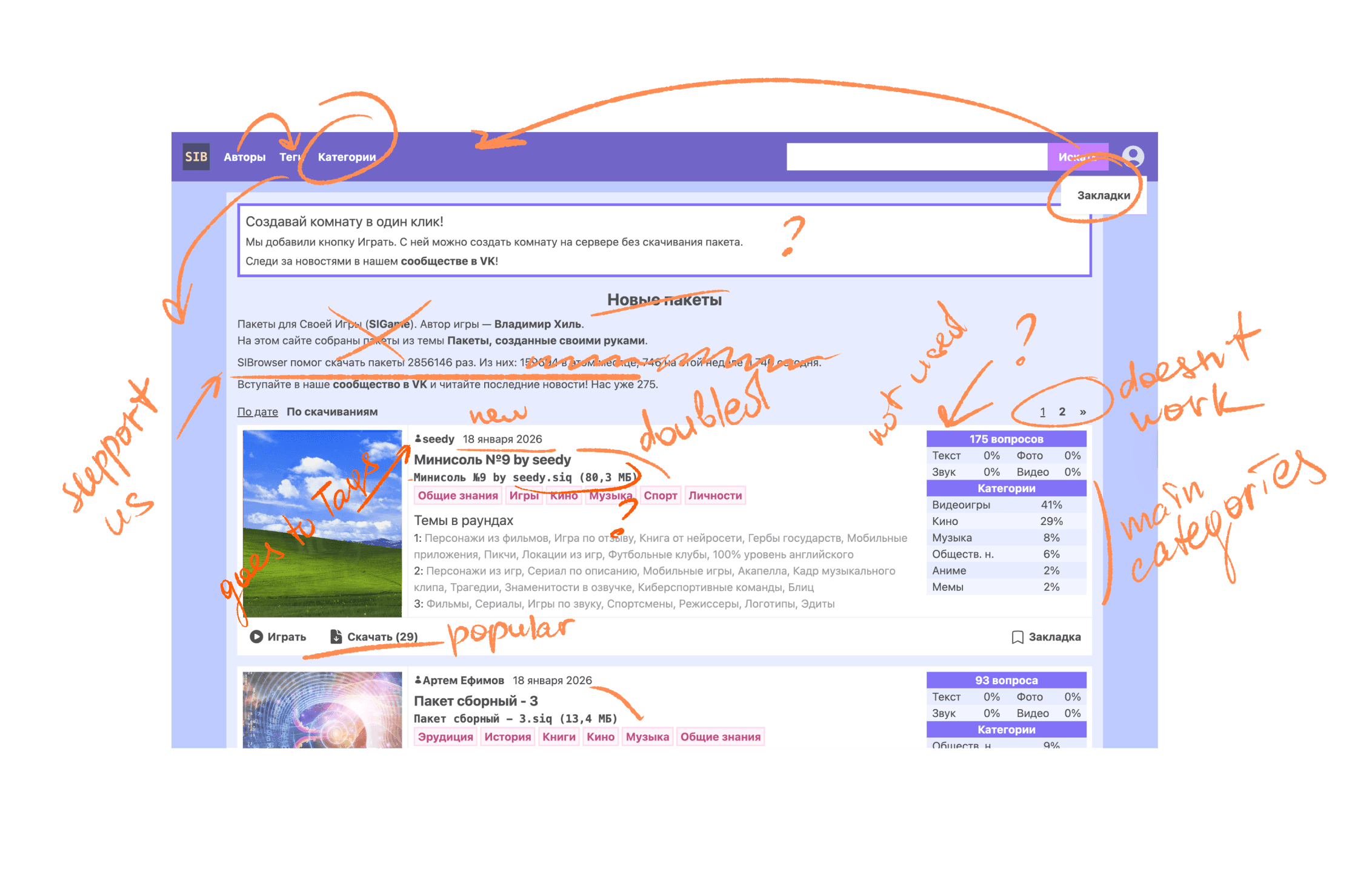
Information Restructuring
At this stage, I explored different ways to restructure information on the page.
I tested simplified card layouts, alternative category placement and variations of primary actions.
The main idea was to remove secondary information from the initial view and keep only what helps users make a quick decision:
what the pack is about and what they can do next.
Information was redistributed based on actual usage patterns:
secondary metadata removed from the first view
long descriptions shortened or moved out of the main flow
unused category blocks removed
author attribution deprioritized and moved into tags
Before

After

Result

Visual System & Interaction
The final design introduces:
clear hierarchy across the homepage
homepage first visit/logged in states
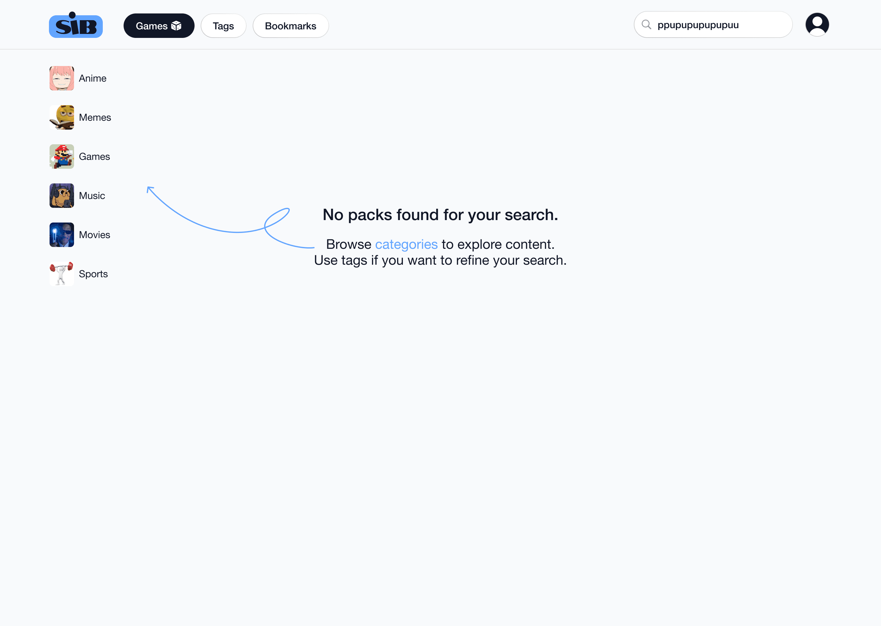
Play / Download/ Bookmarks as primary CTAs
category icons with meme-inspired visuals to support fast recognition
popular categories surfaced as navigation anchors


SIBrowser. website redesign
Redesign of a content-heavy site with user-generated quiz packs for Svoya Igra. Focused on content clarity, hierarchy, and usability without changing core functionality and vibe.
Project
Overview
The original website was created by a developer and was primarily focused on technical functionality rather than user experience.
Original website
Initial Review
The platform follows a guest-first access model. All core actions are available without registration, which is clearly communicated on the first visit.
The authenticated state extends the same experience, allowing users to upload and manage packs for authors. I audited the existing homepage and pack cards to understand how content is scanned and which elements block decision-making.
Main issues:
excessive text density
weak visual hierarchy
categories that were rarely used or left empty
low-signal metadata occupying primary space
Problem Definition
The redesign focused on three core problems:
unclear entry point for first-time users
primary actions not visually dominant
content discovery dependent on reading rather than recognition
The goal was to improve clarity without adding new functionality.
SIBrowser is a web-first desktop experience, where most interactions with quiz packs currently happen.
Process
Information Restructuring
At this stage, I explored different ways to restructure information on the page.
I tested simplified card layouts, alternative category placement and variations of primary actions.
The main idea was to remove secondary information from the initial view and keep only what helps users make a quick decision:
what the pack is about and what they can do next.
Information was redistributed based on actual usage patterns:
secondary metadata removed from the first view
long descriptions shortened or moved out of the main flow
unused category blocks removed
author attribution deprioritized and moved into tags
Before
After
Result
Visual System & Interaction
The final design introduces:
clear hierarchy across the homepage
homepage first visit/logged in states
Play / Download/ Bookmarks as primary CTAs
category icons with meme-inspired visuals to support fast recognition
popular categories surfaced as navigation anchors
Redesign of a content-heavy site with user-generated quiz packs for Svoya Igra.
SIBrowser. website redesign

Project Overview
The original website was created by a developer and was primarily focused on technical functionality rather than user experience.
Original website
Initial Review
The platform follows a guest-first access model. All core actions are available without registration, which is clearly communicated on first visit.
The authenticated state extends the same experience with the ability to upload and manage packs for authors.
I audited the existing homepage and pack cards to understand how content is scanned and which elements block decision-making.
Main issues:
excessive text density
weak visual hierarchy
categories that were rarely used or left empty
low-signal metadata occupying primary space
Problem Definition
The redesign focused on three core problems:
unclear entry point for first-time users
primary actions not visually dominant
content discovery dependent on reading rather than recognition
The goal was to improve clarity without adding new functionality.
SIBrowser is a web-first desktop experience, where most interactions with quiz packs currently happen.
Process
Information Restructuring
At this stage, I explored different ways to restructure information on the page.
I tested simplified card layouts, alternative category placement and variations of primary actions.
The main idea was to remove secondary information from the initial view and keep only what helps users make a quick decision:
what the pack is about and what they can do next.
Information was redistributed based on actual usage patterns:
secondary metadata removed from the first view
long descriptions shortened or moved out of the main flow
unused category blocks removed
author attribution deprioritized and moved into tags
Before
After
Result
Visual System & Interaction
The final design introduces:
clear hierarchy across the homepage
homepage first visit/logged in states
Play / Download/ Bookmarks as primary CTAs
category icons with meme-inspired visuals to support fast recognition
popular categories surfaced as navigation anchors